
Appearance
Shopify App: Search
The Shopify App allows you to activate Relewise Search with a few simple clicks. It provides two search experiences for your theme's search interface:
- Search Overlay provides Product results and suggestions as the shopper types.
- Universal Search provides a larger search experience with separate tabs for Products, Product Categories, and Content, as well as configurable suggestions and recommendations.
You can use either Search Overlay or Universal Search. When using Search Overlay, you can add the Search Results Component to serve Product search results as a block in your Shopify sections. Universal Search displays all results inside its dialog and does not use the Search Results Component.
Shopify App: Search Overlay
To activate the Search Overlay, first enable the Relewise UI Components, and then activate the Search Overlay on the same page.
When activated, the Relewise Search Overlay replaces your theme's existing search interface.
By default it targets elements with the <predictive-search> or <search-form> HTML tags that most Shopify themes use.
If your theme uses something else, enter a CSS selector in the Custom Search Overlay Selector setting to point directly at your search element.
If you're unsure which selector to use, refer to guidance such as the CSS selector reference on W3Schools.
For example, the selector .header-search, #search-mobile targets both a desktop input with the class header-search and a mobile element with the ID search-mobile.
Use a selector that matches only the element(s) you want replaced; the overlay swaps out every element that matches the selector you provide.
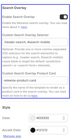
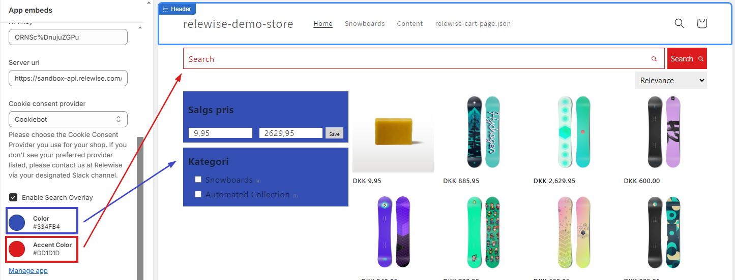
Here, you will also find two options for customization: Color and Accent Color. These settings define the color of both the Search Overlay and the Search Component described below. Use them to match your search components to the rest of your store theme. We also provide several CSS hooks for additional customization. Read more here.
When shoppers interact with results in the Search Overlay:
- Clicking a Search Term Suggestion takes the shopper to the Shopify search results page with that term.
- Clicking a Product takes the shopper to that Product page.
Shopify App: Universal Search
Universal Search opens an expanded search experience directly from your theme's existing search trigger. It can search across Products, Product Categories, Shopify blog posts, and Shopify pages in one interface. Results are organized into separate tabs, so shoppers can move between entity types without leaving the search experience.
Universal Search can also show Popular Search Terms and Search Term Predictions while the shopper types. Recommendations can fill the initial view and zero-result states, helping shoppers continue exploring even before they enter a query or when a search does not return results.
Configure Universal Search
Open the Relewise Shopify App and select Universal Search from the app navigation. Before you can save the Universal Search configuration, assign an existing Search Configuration. The assigned Search Configuration controls Product facets and sorting in Universal Search.
Default configuration
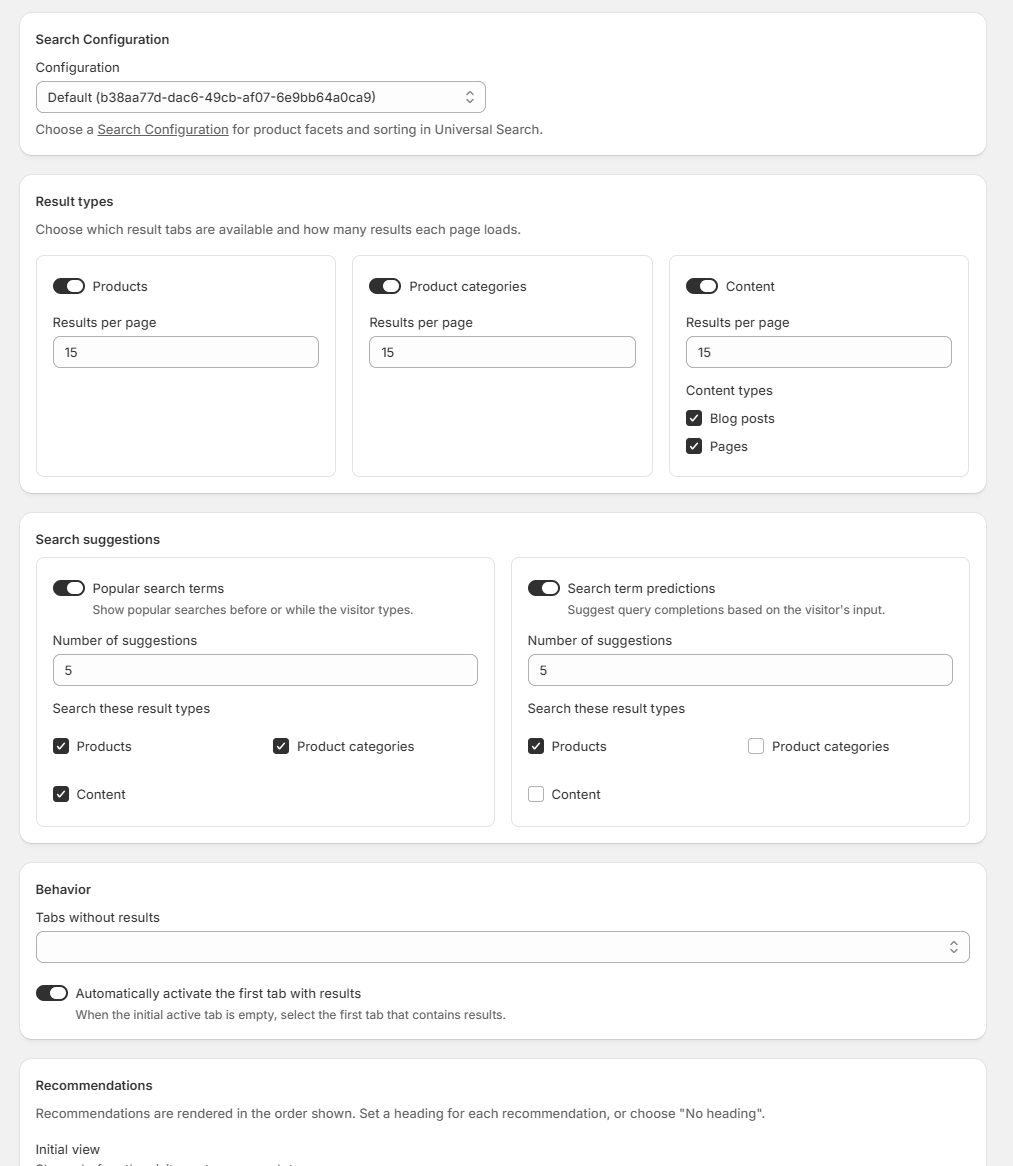
By default, all three result types are enabled with 15 results per page. Both Content types are selected. Popular Search Terms show five suggestions across all result types, while Search Term Predictions show five suggestions based on Products. Empty tabs remain visible, the first tab with results is activated automatically, and no recommendations are configured.
Result Types
Use Result types to decide which tabs Universal Search displays. The available result types are:
- Products
- Product categories
- Content
Each enabled result type has its own Results per page setting. Disabling a result type removes its tab from Universal Search.
For Content, select one or both of the supported Shopify content types:
- Blog posts searches Shopify articles.
- Pages searches Shopify pages.
Both Content types are selected by default. If Content is enabled, at least one Content type must be selected before the configuration can be saved.
Search Suggestions
Universal Search supports two independently configurable suggestion types:
- Popular search terms show searches that are popular with shoppers.
- Search term predictions suggest query completions based on what the shopper enters.
For each suggestion type, you can enable or disable it, choose how many suggestions to show, and select which result types—Products, Product Categories, and Content—are used when producing suggestions.
Behavior
Use the Behavior settings to control what happens when result tabs are empty:
- Tabs without results can remain visible or be hidden.
- Automatically activate the first tab with results moves the shopper to the first non-empty tab when the initially active tab has no results.
Recommendations
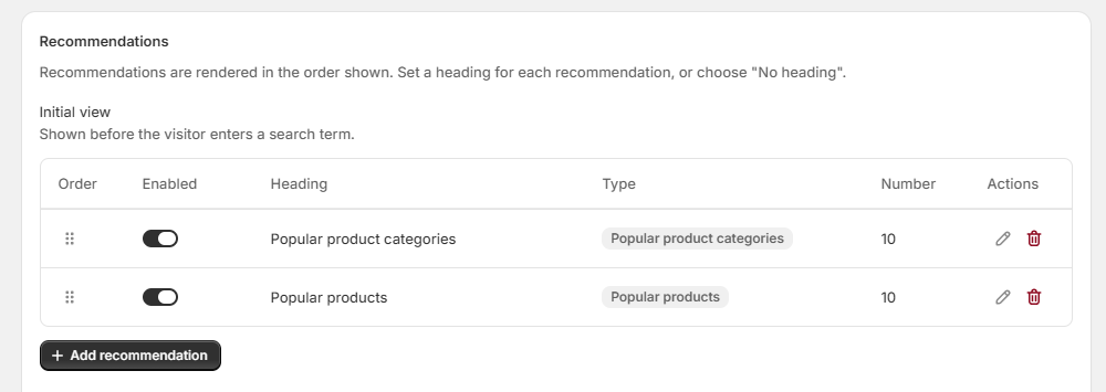
Recommendations let Universal Search remain useful before a shopper searches and when a query returns no results. You can configure separate ordered recommendation lists for:
- Initial view, shown before the shopper enters a search term.
- No visible result tabs, shown when all empty tabs are hidden.
- No product results, shown in an empty Products tab.
- No product category results, shown in an empty Product Categories tab.
- No content results, shown in an empty Content tab.
Each list can contain multiple recommendation blocks. Drag the blocks into the order in which they should appear, and enable or disable individual blocks without deleting them. For each block, configure the recommendation type, number of recommendations, and heading. A heading can use a default value with language-specific translations, or it can be hidden entirely.
The following recommendation types are available:
- Popular Products
- Personal Product Recommendations
- Recently Viewed Products
- Popular Product Categories
- Popular Content
- Personal Content Recommendations
- Popular Content Categories
- Popular Search Terms
- Search-Term-Based Products
When you are finished, select Save. Changes are not applied to the storefront until the configuration has been saved.
Sync Universal Search Across Stores
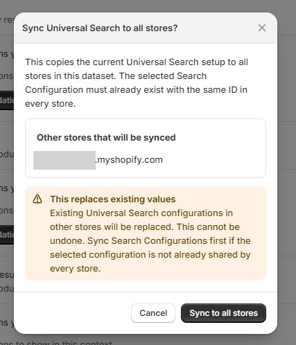
If more than one Shopify store is connected to the same Relewise dataset, the Universal Search configuration page also provides a Sync to all stores action. Use it to copy the complete current Universal Search setup—including result types, suggestions, behavior, and recommendations—to every other connected store.
Before syncing, make sure the selected Search Configuration already exists with the same ID in every connected store. Universal Search references that configuration but does not create or copy it. If necessary, sync your Search Configurations first.
To sync the setup:
- Select Sync to all stores.
- Review the stores listed in the confirmation dialog.
- Select Sync to all stores to confirm.
Existing configurations are replaced
Syncing saves the current setup and replaces the existing Universal Search configuration in every other connected store. This cannot be undone.
Activate Universal Search in Your Theme
After configuring Universal Search in the app:
- In the Shopify admin, go to Online Store -> Themes and open the theme editor.
- Open App embeds and select Relewise UI.
- Enable Search.
- Set Search experience to Universal Search.
- Save the theme.
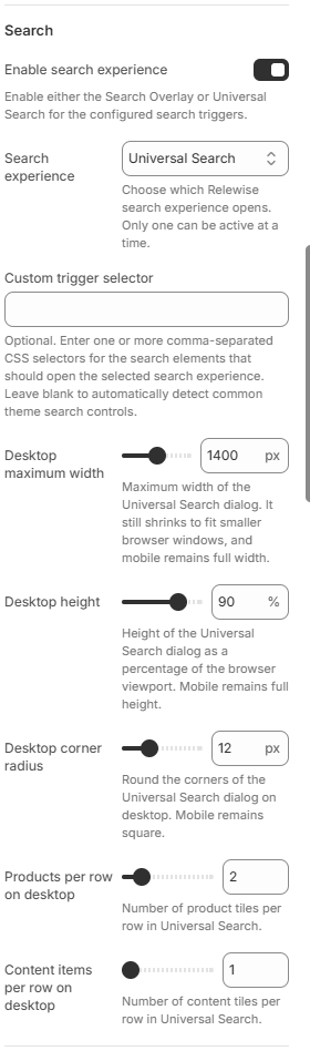
By default, the app detects common Shopify search buttons and search forms and uses them to open Universal Search. If your theme uses a custom search trigger, enter a CSS selector in Custom trigger selector. You can provide a comma-separated selector to target more than one element, for example .header-search, #search-mobile.
Use a selector that matches only the intended search triggers. If the selector is invalid or matches no elements, the app falls back to automatic detection.
Cards and Styling
Universal Search uses the general Product and Content card settings from the Relewise UI app embed. You can configure native Shopify templates separately for Products, blog posts, and pages. See Native Product and Content Cards for setup instructions.
The app embed's Color and Accent Color settings apply to Universal Search. When Universal Search is selected as the search experience, the app embed also provides these layout settings:
- Desktop maximum width controls the dialog's maximum width from 800 px to 2,000 px. The default is 1,400 px, and the dialog still shrinks to fit narrower browser windows.
- Desktop height controls the dialog height from 60% to 100% of the browser viewport. The default is 90%.
- Desktop corner radius controls the dialog's corner radius from 0 px to 40 px. The default is 0 px.
- Products per row on desktop controls Product tile grids from one to eight columns. The default is five.
- Content items per row on desktop controls Content tile grids from one to eight columns. The default is five.
These settings apply to the desktop dialog. On mobile, Universal Search remains full width and full height with square corners.
For more advanced theme customization, use the public CSS custom properties and parts provided by the Relewise Web Components.
Customer-facing labels follow the storefront locale. Recommendation headings can also be translated per language in the Universal Search configuration.
Shopify App: Search Results Component
The second part of setting up Search is to navigate to your Theme Customization, and select the Search results page defined in your Shopify Theme.
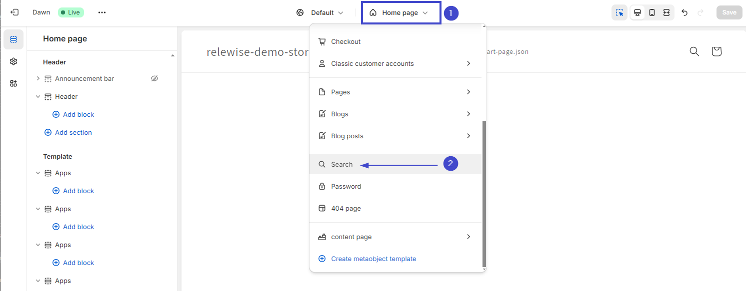
Here, add the Product Search block to your page, by selecting Add Section -> Apps -> Product Search (Relewise):
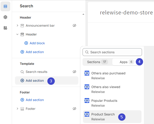
Customize the page with your newly added Search Results Component, and you are ready for your users to utilize Relewise's fast and accurate search of your products.