
Appearance
Shopify App: Activating UI Components
Now that the integration has been set up to pull product data from your shop, it is time to activate the components that allow you to perform personalized search and recommendations. To do so, enable the Relewise UI Components app embed in your theme.
Supported Storefront Capabilities
The app embed can power the following storefront capabilities:
| Service | Capability | |
|---|---|---|
| Behavioral Tracking | Cart Product View Product Category View Content View | [Settings Preview] |
| Search | Product Search Search Term Prediction Search Collection | [Settings Preview] |
| Product Recommendations | Purchased with Product Purchased with Multiple Products Products Viewed After Viewing Product Products Viewed After Viewing Content Popular Products Recently Viewed Products Personal Products | [Settings Preview] |
| Content Recommendations | Contents Viewed After Viewing Content Contents Viewed After Viewing Product Contents Viewed After Viewing Multiple Products Popular Contents Personal Contents | [Settings Preview] |
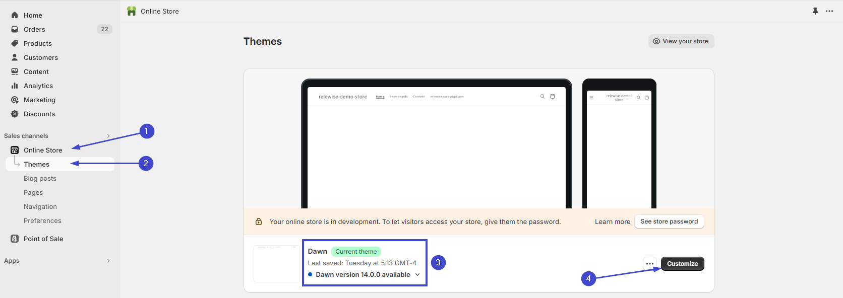
Activate the UI Components by navigating to Online Store -> Themes, and click the Customize button.
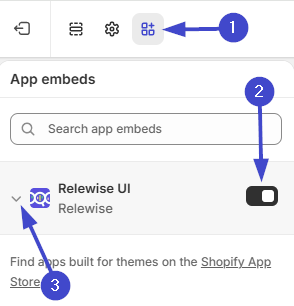
Navigate to the App Embeds setting, and activate the Relewise UI Components. Then, open the App to configure it.
Product Result Settings
The Product result settings section controls which Products and Variants the Relewise UI Components request.
Hide Sold-Out Products
Enable Hide sold-out products to exclude unavailable Products from all Relewise search results and Product Recommendations. This includes the Search Overlay, search results pages, collection pages, and storefront Product Recommendation blocks.
The Shopify app applies a Product data filter that requires the store-specific [store]_AvailableForSale Data Key to be true. The app keeps this value synchronized with whether Shopify considers the Product available for sale. The setting is disabled by default.
Variant Request Settings
Variant request settings apply to the Search Overlay, search results pages, and collection pages. They do not affect Product Recommendations.
- Maximum variants per product: Controls how many Variants Relewise may return for each Product. Enter a non-negative whole number. Use
0for Product-only results,1for one selected Variant per Product, or2or more to return multiple Variants per Product. The default is1. - Variant sorting: Controls how returned Variants are ordered. Grouped by product keeps Variants together under their Product and is the default. By relevance orders concrete Variants by their Variant-level relevance.
For more information about how these values affect Product and Variant results, see Variant Request Settings.
Component DOM and Styling Settings
The Relewise UI Components app embed includes settings for how Relewise Web Components render in your theme:
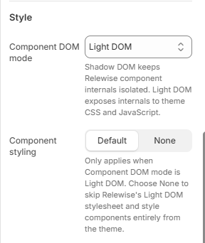
- Component DOM mode: Choose whether components render with
Shadow DOMorLight DOM. Shadow DOM is the default and keeps the component internals isolated. Light DOM renders the component internals directly into the page, so normal Shopify theme CSS and third-party scripts can query and modify them. - Component styling: Choose whether Relewise injects its default Light DOM stylesheet. This setting only applies when Component DOM mode is set to
Light DOM; Shadow DOM components keep their scoped styling.
Use Light DOM when a Shopify theme script or app needs access to rendered Relewise internals, such as wishlist apps that need to attach controls to Product cards.
Keep Component styling set to Default if you want Relewise to provide the baseline layout and component styling. Choose None only when your theme CSS will fully style the rendered component markup.
Once the embed is enabled, continue with the relevant storefront features you want to use, such as Search, Recommendations, Behavioral Tracking, or User Engagement.